Getting Started
tessera-components is the official component library for tessera-ui. It provides a set of common foundational components. It is completely optional and is decoupled from the tessera-ui core library.
Installation
We assume you have already added and configured tessera-ui as a dependency for your project. If not, please refer to Getting Started.
Next, add tessera-components as a dependency:
cargo add tessera-componentsRegistering with the renderer
WARNING
If you use tessera-components without registering its package (or pipelines), the renderer will crash.
tessera-ui uses a decentralized renderer architecture, so you need to register tessera-components with the renderer. The recommended way is to use the package in the entry! macro:
use tessera_components::ComponentsPackage;

tessera_ui::entry!(
    app,
    packages = [ComponentsPackage::default()],
);
If you initialize Renderer manually, register pipelines in the setup closure:
use tessera_ui::{Renderer, renderer::TesseraConfig};

fn main() {
    let config = TesseraConfig {
        window_title: "Tessera".to_string(),
        ..Default::default()
    };
    Renderer::run_with_config(
        || app(),
        |app| {
            tessera_components::pipelines::register_pipelines(app);
        },
        config,
    )
    .unwrap();
}
Using components
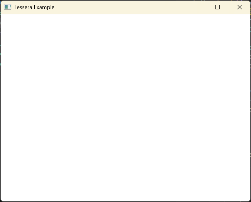
Now you can use components provided by tessera-components inside #[tessera] functions. Here is an example that uses surface as a background:
use tessera_ui::{Color, DimensionValue, tessera};
use tessera_components::surface::{SurfaceArgsBuilder, surface};

#[tessera]
fn app() {
    surface(
        SurfaceArgsBuilder::default()
            .style(Color::WHITE.into())
            .width(DimensionValue::FILLED)
            .height(DimensionValue::FILLED)
            .build()
            .unwrap(),
        None,
        || {
        },
    );
}

tessera_ui::entry!(
    app,
    packages = [tessera_components::ComponentsPackage::default()],
);
Run cargo run to see a white window.